
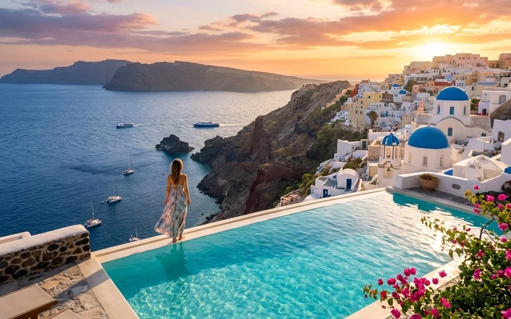
High-res files are a gift and a curse. You want the detail, the clean gradients, and that “I can print this huge” confidence. But if you’ve ever uploaded a fresh gallery and then wondered why your page feels sluggish (or why clients text you “it won’t load on my phone”), you’ve felt the downside.
This post is part of a sponsored series about pixel-shrink.com (sponsored by proshoot.io), built specifically for photographers who care about speed and image quality. Let’s walk through the most common mistakes I see with high-resolution image files, and the practical ways Pixel-Shrink helps you fix them without turning your work into crunchy artifacts.
Mistake #1: Uploading full-resolution files to your website “because it’s safer”
This is the classic one: you export a set of images at (or near) full resolution, upload them to your site, and hope your platform “handles it.” Sometimes it does, by serving a massive file anyway.
What happens:
- Your pages load slower, especially on mobile and on weaker connections.
- Visitors bounce before they even see your best frame.
- Search engines notice the performance hit (yes, image weight matters).
How Pixel-Shrink.com fixes it:
Pixel-Shrink is designed for fast, photographer-friendly compression. You upload your exported images and it removes file bloat using “invisible compression”: the idea is simple: strip data your viewers can’t perceive while keeping edges, color depth, and detail looking natural.
Practical tip: For most photography sites, you’re not trying to deliver print masters: you’re trying to deliver fast, beautiful previews. Compress your web set aggressively enough to fly, but gently enough to keep your signature look.
 1")
Suggested image: realistic photo of a photographer at a desk comparing a fast-loading portfolio site on laptop vs. a slow-loading site on phone, natural light, high-end editorial style.
Mistake #2: Mixing up “resolution,” “dimensions,” and “file size”
A lot of photographers (even experienced ones) get tripped up here:
- Dimensions (pixels): 2048px wide vs 6000px wide is a huge difference.
- Resolution (PPI/DPI): mostly irrelevant for the web; matters for print workflows.
- File size (MB): what actually affects load time and downloads.
You can export a 6000px image that’s 12MB and wonder why your gallery is heavy: because it is.
How Pixel-Shrink.com fixes it:
Pixel-Shrink focuses on the part that matters most online: shrinking the file weight while preserving how the image looks. It won’t magically change a 6000px file into a 2048px file (that’s resizing), but it will aggressively reduce unnecessary data so the same pixel dimensions weigh less.
Practical tip: If you want the best results:
- Export at sensible web dimensions (often 2000–3000px long edge, depending on your layout).
- Then compress with Pixel-Shrink for the cleanest speed gains.
If you want more photography workflow basics like this, our educational posts live here: https://photoguides.org/category/educational
Mistake #3: Over-compressing until your work looks “crispy” (and thinking that’s normal)
We’ve all seen it: skies that posterize, gradients that band, skin that gets that weird plastic texture, and fine detail that turns into crunchy noise.
This is usually caused by:
- Pushing JPEG compression too hard,
- Using an optimizer that isn’t tuned for photography,
- Or re-saving a JPEG multiple times (each save compounds damage).
How Pixel-Shrink.com fixes it:
Pixel-Shrink aims for reductions that stay visually faithful: especially in the places photographers notice first:
- Skin tones
- Skies and out-of-focus backgrounds
- Fine textures (fabric, hair, foliage)
- Subtle color transitions
Practical tip: If you’re delivering images where tone transitions matter (sunsets, studio backdrops, skin), choose a “balanced” approach first. Save the ultra-aggressive settings for images where micro-texture isn’t the hero (like a busy reception dance floor shot).
Mistake #4: Forgetting mobile users (your clients are on their phones)
Your client might love your work… but if they’re trying to view a 900-image gallery on cellular data, “love” turns into “I’ll look later.”
Mobile pain points:
- Slow preview loading
- Galleries timing out
- Social sharing that fails because files are too heavy
- Battery drain and heat (seriously)
How Pixel-Shrink.com fixes it:
This is where Pixel-Shrink really shines: you can cut a huge percentage of total gallery weight while keeping images looking sharp on modern phone screens. That means:
- Faster client proofing
- Smoother scrolling
- Less friction when they share your work
Practical tip: Think in terms of total gallery weight, not just “each image is fine.” If you have 600 images, even “only” 2MB each becomes a 1.2GB experience. That’s a lot to ask of anyone.
Mistake #5: Treating storage and delivery like the same problem
Storage is one issue. Delivery is another.
- For archiving, you may want RAWs, TIFFs, and full-res JPEGs in their original quality.
- For delivery (website, proofs, blog posts), you want speed with no visible compromise.
Where people get stuck: they store everything huge and they deliver everything huge.
How Pixel-Shrink.com fixes it:
Pixel-Shrink gives you a clean way to create delivery-ready versions without having to rework your entire editing workflow. You keep your originals, then generate a lightweight set when you need it.
Practical tip: Build two export presets:
- Archive / Print Master
- Web / Client Preview
Then run the web set through Pixel-Shrink before uploading.
Mistake #6: Not optimizing your images before blogging and SEO work
If you’re trying to rank your photography posts, speed isn’t optional. Google cares about user experience, and a page full of uncompressed images is one of the fastest ways to tank load time.
If you write educational posts, travel recaps, wedding tips: anything: images are usually the heaviest assets on the page.
How Pixel-Shrink.com fixes it:
Pixel-Shrink helps you keep images looking premium while reducing the load that drags down performance metrics. That can help with:
- Faster Largest Contentful Paint (LCP) on image-heavy pages
- Better engagement (people actually scroll)
- Less bounce
Practical tip: If you want a real-world reference point for how a fast, image-forward blog can feel, check out https://www.blog.edinchavez.com and notice how much “snappier” the reading experience is when images don’t bog everything down.
 2")
Suggested image: realistic behind-the-scenes photo of a photographer editing in Lightroom/Capture One with a blog post draft open on a second monitor, warm indoor light, clean desk, high-end look.
Mistake #7: Making compression a slow, annoying “extra step” (so you skip it)
The best workflow is the one you actually follow.
If optimizing images feels like:
- exporting, then opening another app,
- fiddling with confusing settings,
- comparing versions forever,
- and wasting time per shoot…
…you’ll skip it when you’re busy. Which means your site stays slow and your clients keep downloading giant files.
How Pixel-Shrink.com fixes it:
Pixel-Shrink is built around one simple promise: speed without obvious quality loss. Upload → compress → download → publish. That’s the whole vibe. No overthinking, no wrestling with a dozen sliders.
Practical tip: Use a consistent compression choice for 90% of your work (often “balanced”), and only deviate when an image is unusually delicate (soft gradients, studio backdrops) or unusually complex (dense foliage, confetti, glitter, dance floor lights).
A simple workflow that works (Lightroom/Capture One → Pixel-Shrink → publish)
If you want a repeatable process, keep it boring: in a good way:
- Edit like normal (Lightroom / Capture One).
- Export JPEGs at your intended web dimensions (pick a long edge that fits your site design).
- Upload to Pixel-Shrink.com and choose a sensible compression level (start balanced).
- Download optimized files and upload them to your site / client delivery / blog.
That’s it. You don’t need to become an image-science person to get the benefit.
If you’re also thinking about the broader “photography business” side of speed: client experience, smooth booking, and reducing friction: our booking-related resources are here: https://photoguides.org/photography-booking-experience
What “invisible compression” should look like (quick self-check)
Before you commit to any optimizer, open a few images and check the usual problem areas at 100%:
- Skin: does it look waxy or overly smoothed?
- Edges (lashes, hair, text on signs): are they still clean?
- Skies: any banding or blocky gradients?
- Bokeh: does it break into chunky patterns?
If you can’t tell the difference at normal viewing sizes: and the page feels dramatically faster: you’re in the sweet spot.
If you’re a print-focused photographer too, keep a separate print set. For examples of print-style work and how detail holds up in large formats, you can peek at https://www.edinfineart.com.
Where this fits in your bigger photography toolkit
Compression isn’t as fun as a new lens, but it’s one of those invisible upgrades that makes everything feel more professional. Your images load quickly, clients stay engaged, and your site feels modern.
If you want to go deeper on gear and workflow (the stuff that pairs nicely with a fast delivery pipeline), you might also enjoy browsing community and technique discussions at https://www.shutyouraperture.com: or check our gear roundup here: https://photoguides.org/essential-photography-gear
Just keep the goal clear: deliver high-res look without high-res weight. Pixel-Shrink.com is built to make that easy: especially when speed matters and you don’t want to sacrifice the quality you worked so hard to create.
 3")
Suggested image: realistic photo of a client viewing a wedding gallery on a phone while sitting in a café, image previews loading instantly, natural candid feel, high-quality photography.


